Brand Identity
MESOP was an independent Melbourne fashion label known for its signature fabrication. As Creative Communications Manager, I led a full brand transformation — repositioning MESOP from a single-fabrication product line into a cohesive ready-to-wear lifestyle brand.
This is the thinking behind the shift.
The Brief
Evolving MESOP from a single-signature product into a full lifestyle brand meant reintroducing ourselves — not only to our customers, but to ourselves. While retaining our iconic fabrication line, we needed to define who the MESOP woman was, and how that identity translated into a broader brand world.
This was a ground-up rebrand: from internal messaging and team alignment, to campaigns, logo, packaging, and product offering. My role was to unite all parts of the business — from sales to design to customer touchpoints — around a new, shared direction.
Services
Brand Identity, Logo Design, Art Direction, Internal communications, packaging, EDMs, Social Media Content & Strategy, Copy Writing, Campaign Production, Styling, Image Editing.
Tools
Adobe Suite - Photoshop, Indesign and Illustrator, Mail Chimp.


Brand Identity & Positioning
With a broader market in sight, we looked to lifestyle brands like Country Road, Toast, and Apiece Apart as benchmarks — labels that offered more than fashion; they offered a world. MESOP needed to step beyond its fabrication roots and invite customers into a lifestyle that was easy to wear, quietly directional, and inclusive by design.
We distilled the brand into a simple, guiding essence — a touchstone for every creative and strategic decision to follow. Two key words emerged at the heart of MESOP’s identity: Craftsmanship and Beautiful Thinking. These became the foundation of all brand communication — shaping everything from product storytelling to tone of voice and visual identity.
The first step was refining the logo. We pulled it back into a timeless, modernist frame — a simple sans serif wordmark that felt recognisable, sophisticated, and quietly confident. This subtle restraint allowed the clothing — and the brand world — to take centre stage.
Art Direction and Campaigns
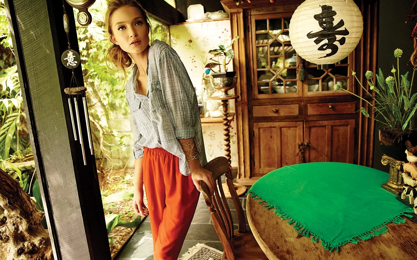
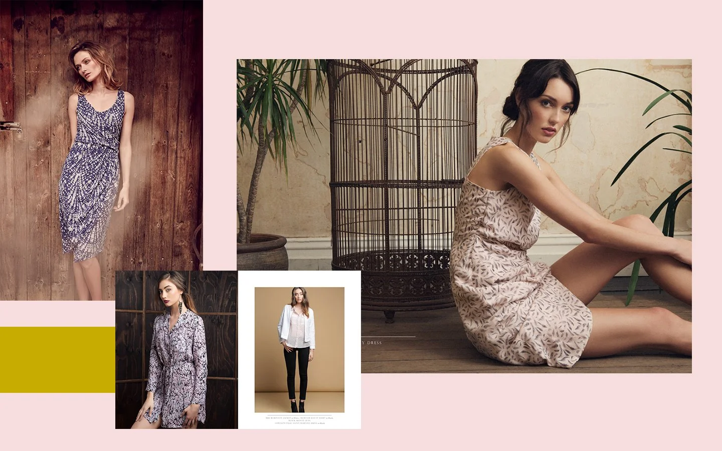
In close collaboration with the design team, I led the art direction across all campaigns. Our focus was to build a world around the clothing — where casting, styling, and location choices shaped a brand narrative that felt lived-in, warm, and quietly aspirational.
We balanced commercial needs with creative storytelling. While e-commerce was supported with clean studio shoots and versatile statics, campaigns were where the brand's emotional tone came to life. Each shoot was designed to feel real — less polished editorial, more “glimpse into the life of.” The result was a visual language that felt authentic, inviting, and grounded in the everyday beauty of the MESOP woman.
Some of our favourite photographers to work with included; Jo Duck, Zac Handley and Andrew Gough.


Tone of Voice
Tone of voice was a crucial lever in the rebrand — a way to stand apart from larger high street players by embracing the intimacy of an independent voice.
Our language was friendly, real, and subtly styled — like your put-together best friend sharing a great find. We leaned into warmth with just the right hint of cheek, moving away from sales-y copy toward something more personal and conversational.
This voice was rolled out consistently across all touchpoints — from EDMS and social media to B2B communications — helping to shape a brand that felt approachable and thoughtful.
Internal Communications
Internal brand alignment is often underestimated — but it’s one of the most powerful outcomes of a rebrand. A key part of this process was bringing everyone onto the same page, from the CEO to the design team and sales agents across Australia.
I led conversations with stakeholders at every level, drawing on their insight to create a unified brand narrative that still honoured the nuances of our different customer relationships. This thinking was distilled into a suite of internal documents that communicated the brand across multiple layers — allowing team members to intuit and express the identity in ways that felt authentic to their role.
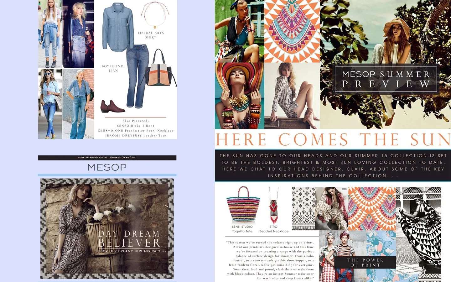
It was especially rewarding to see how the brand evolved season by season — how the design aesthetic matured, and how the sales teams built richer product stories with each collection. For our wholesale agents, we provided the tools to truly bring the brand to life: moodboards, seasonal inspirations, lookbooks, trend reports, B2B sales EDMs, and detailed styling guidance.
It’s in the details
While Craftsmanship sat naturally within design and production, I wanted it to be visible in our imagery and storytelling too. We focused on materiality — the raw beauty of texture, the integrity of finish — making sure the care behind each piece was seen, not just felt.
Beautiful Thinking was more subtle. It lived in the small, surprising details that delighted customers in their experience with the brand. This meant notes on swing tags that told you which book would fit in your new bag, or described your jeans like a character. It was personality, intimacy, and intention — present in every touchpoint.
Our sales agents knew the stories behind every collection: why a particular grey tone flatters everyone, or how a vintage-style yoke lifts a blouse from staple to standout. From close-up shots of yarn spools at our local knitwear mills, to still lifes that built a world around a bag — everything was considered, and everything pointed back to the essence of MESOP.
Rebrands can be risky
— but through careful strategy and storytelling, we brought both internal stakeholders and customers along with us. By inviting them into the process, we built trust and momentum organically.
The result was a brand that not only retained its loyal base but expanded significantly — attracting new wholesalers across Australia and prompting the launch of a successful subsidiary label to meet growing demand.
Personally, one of the most rewarding moments was handing the reins to the next art director and watching the brand continue to flourish — carried forward by the strong foundation we had built together.