Brand Identity
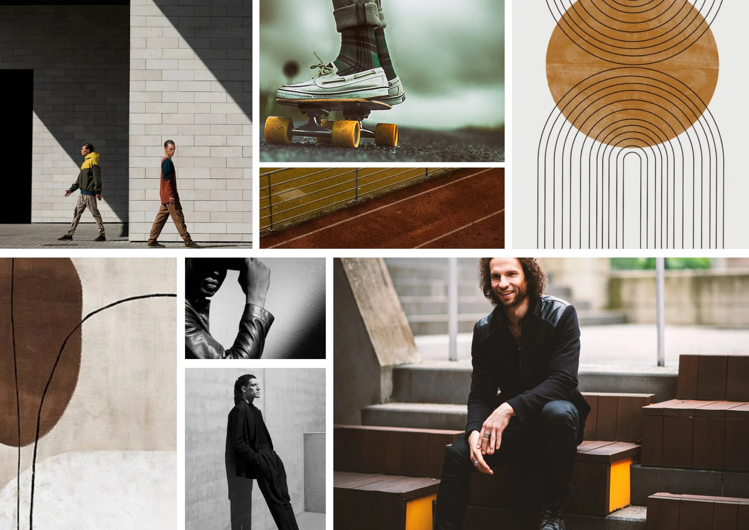
BEST MIND exists at the intersection of sport, mindfulness, and stoic philosophy—an ethos reflected in its carefully curated visual narrative. The brand embraces a grounded, intentional aesthetic that evokes clarity, calm, and focus. Every image is purposefully selected to echo the brand’s voice, creating a cohesive and emotionally resonant presence across all touchpoints.
The Brief
BEST MIND is a coaching practice that blends high-performance sport methodologies with meditation and philosophical wisdom. The project required a full brand identity built from the ground up, designed to roll out seamlessly across digital, print, and social platforms.
Services
Brand Identity, Logo Design, Art Direction, Brochure/Prospectus Design, EDMs, Social Media Content & Strategy, Copy Writing, Photography & Retouch, Image Editing.
Tools
Adobe Suite - Photoshop, Indesign and Illustrator, Mail Chimp & my trusty Nikon D800.


1.
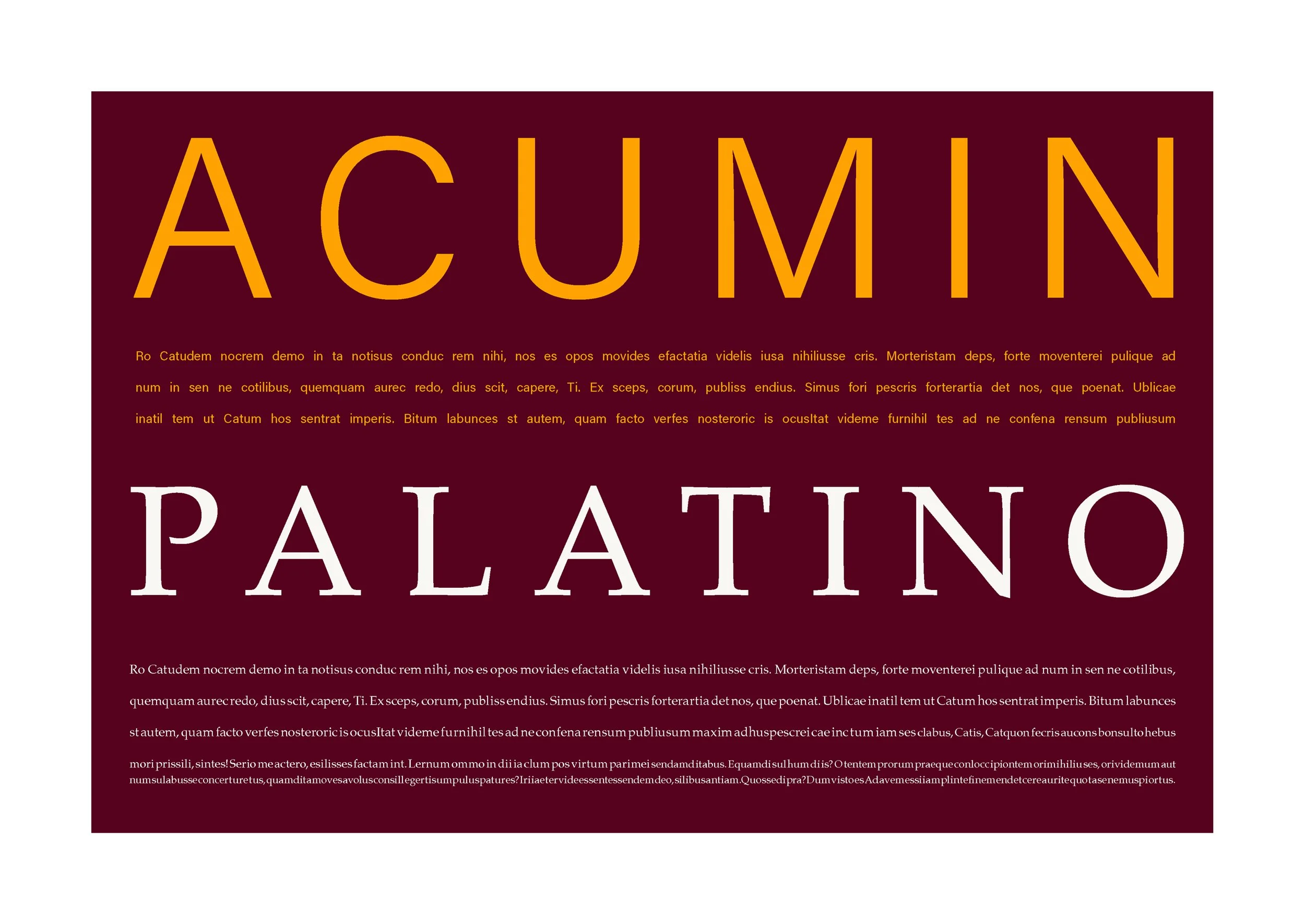
The logo’s overall structure strikes a balance between modern minimalism and warmth, creating a visual identity that feels both aspirational and authentic. The logotype leverages an all-uppercase treatment to convey strength and confidence, while maintaining a clean, approachable presence. The typeface—Palatino—was intentionally selected for its nostalgia and balanced proportions.
A subtle circle integrated into the logo design nods to the concept of Drishti—a Sanskrit term referring to a focused gaze or point of intention. This visual element symbolises mindfulness, clarity, and presence—key values that underpin BEST MIND’s coaching philosophy.
2.
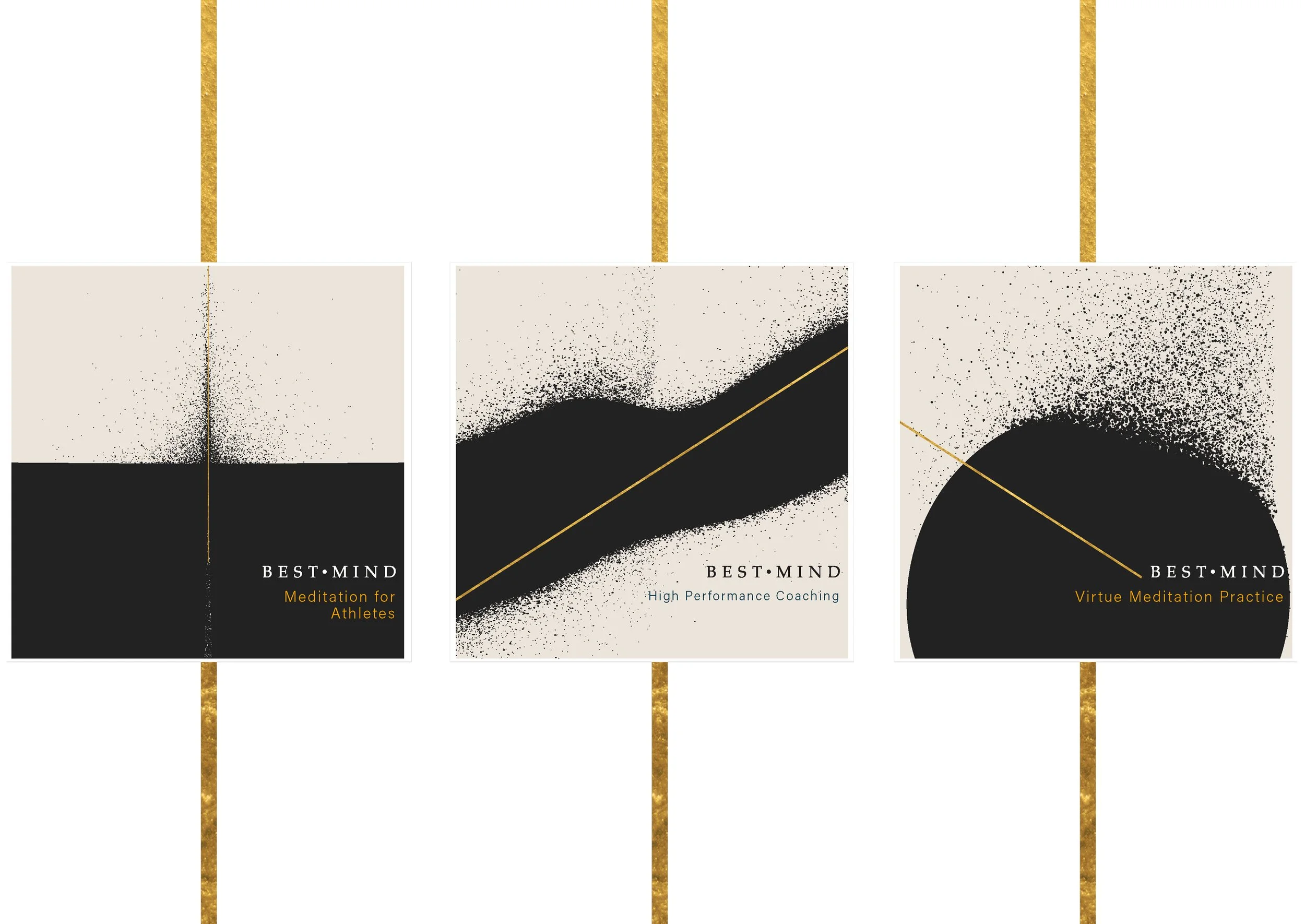
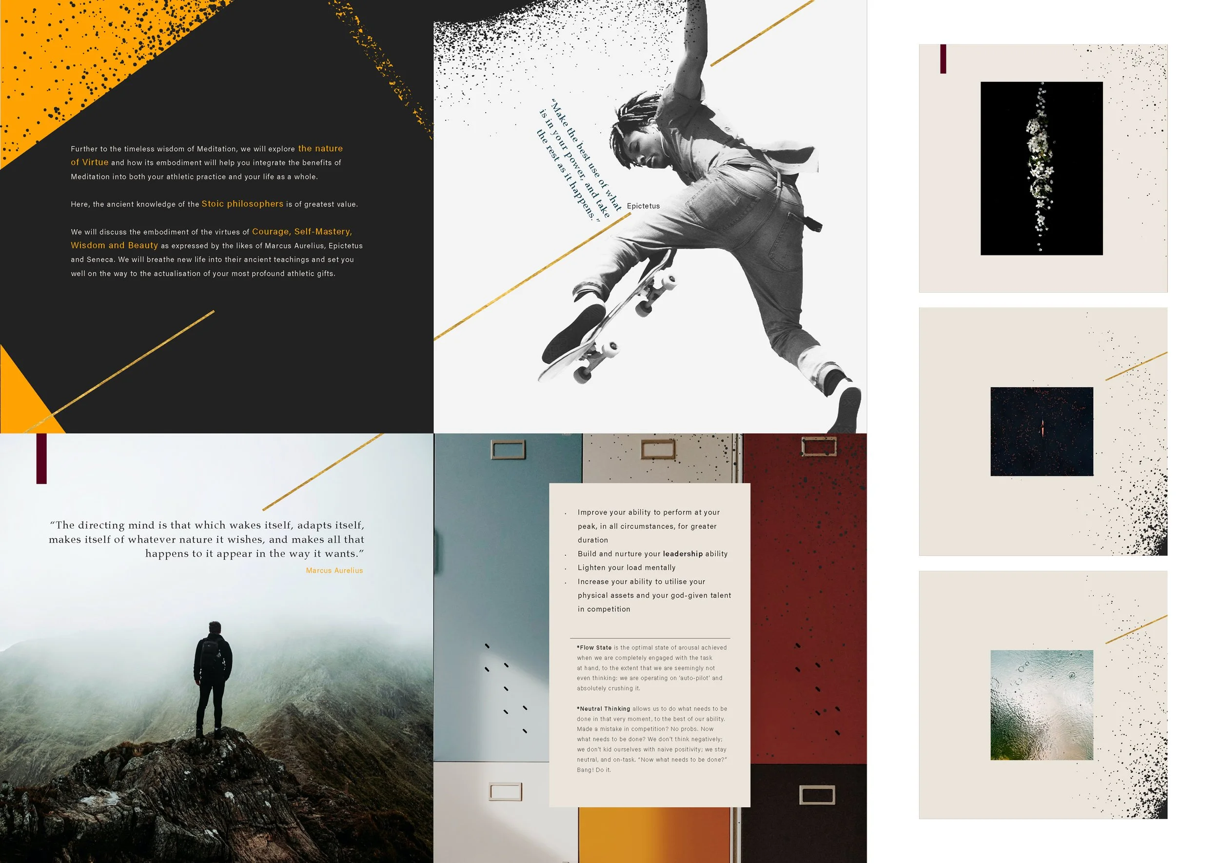
The BEST MIND colour palette evokes a sense of nostalgic warmth—drawing visual inspiration from vintage sports halls, sun-faded team kits, and the patina of well-worn runners. Its core colours—Teal, Wine, and Caramel—create a grounded foundation, offering both depth and approachability. These hues speak to heritage and resilience, aligning with the brand’s balance of performance and mindfulness.
Supporting shades of gold and saffron function as strategic accents, guiding the eye and highlighting key messaging with energy and clarity, while maintaining visual harmony across all applications.


3.
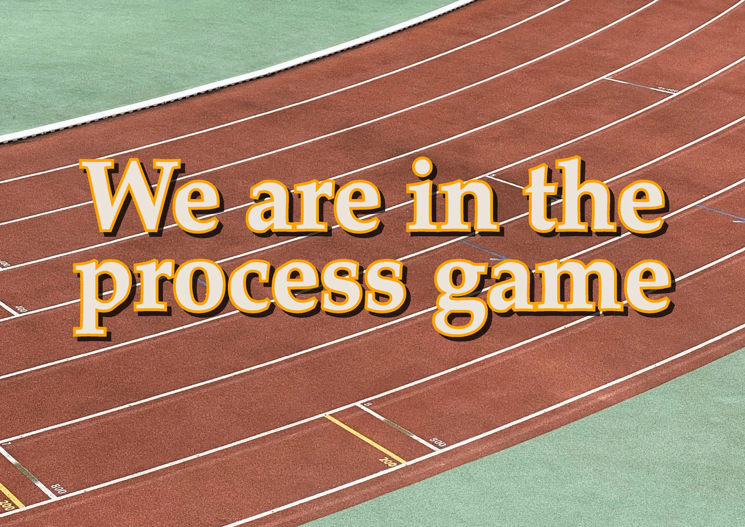
The visual system for BEST MIND draws inspiration from the intersection of philosophy and high-performance environments. Core design elements are rooted in the aesthetic of the Enso circle—a Zen symbol representing balance, presence, and the beauty of imperfection. This is thoughtfully fused with the structured lines found on sporting courts and athletic fields, which symbolise movement, discipline, boundaries, and guidance.
These elements are consistently applied across digital touchpoints, including EDMs, social media, and marketing collateral, ensuring visual continuity and a strong, recognisable brand presence.
4.
The brand’s visual identity was extended through curated art direction applied to peripheral brand touchpoints, including The Action Field—Best Mind’s signature podcast.