Brand Identity
Saints & Lovers was the sister label to MESOP — created to serve a more mature market while staying true to MESOP’s beloved fabrications. The collection balanced timeless “saints” — flattering, elevated essentials you’d reach for every day — with playful seasonal pieces. It was all about building an accessible, feel-good wardrobe that worked for real life.
This one was created from the ground up, built upon what we already knew about our customer.
The Brief
As MESOP evolved, we needed a brand that could evolve with our original customer — not leave her behind. Saints & Lovers was created to honour that loyal audience, using MESOP’s signature fabrication in a smaller, more focused range. The goal was to speak to how she’d changed over time, listen to what she wanted now, and design a wardrobe that felt considered, relevant, and lasting.
Services
Brand Identity, Logo Design, Art Direction, Internal Communications, Packaging, EDMs, Social Media, Graphic Design, Copy Writing, Campaign Production, Image Editing.
Tools
Adobe Suite - Photoshop, Indesign and Illustrator, Mail Chimp.


True Colours
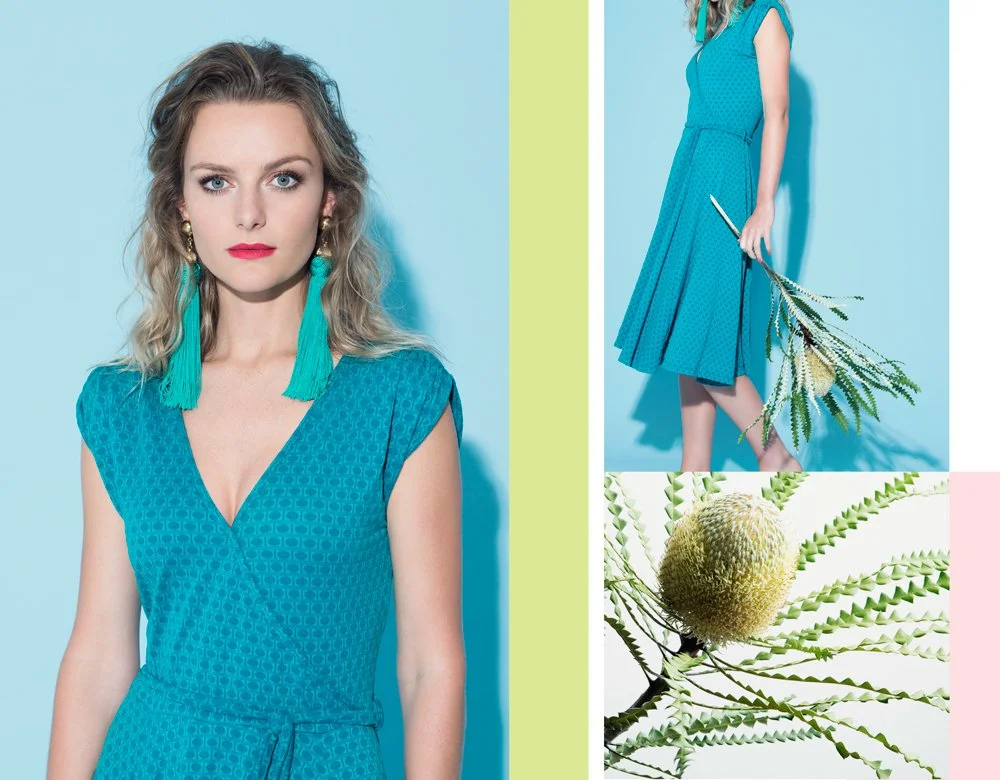
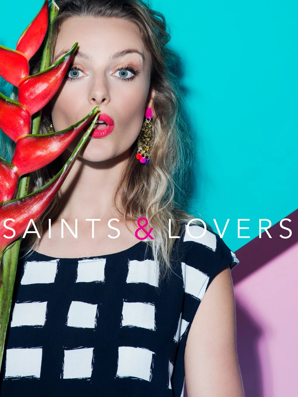
With a single fabrication at its core, Saints & Lovers was always going to be about colour. Instead of following trends or competitive analysis, we looked further — to global and historical masters of colour. The 1960s became a touchstone: graphic, bold, and playful. Simple silhouettes with maximum impact. Colour wasn’t an afterthought — it was the statement, the mood, the brand.
Brand Story
The 1960s influence gave us licence to be playful. It’s where the name came from — Saints & Lovers — a label that didn’t take itself too seriously, but knew how to deliver. The “saints” were your wardrobe heroes: timeless, flattering, and built to last. The “lovers” brought boldness and delight — those special pieces that turn a look into a statement.
This duality became the heartbeat of the brand, echoed in everything from colour stories to showroom snacks: fruit for the saints, chocolate for the lovers. It was cheeky, warm, and instantly memorable — a sister label that felt like your crew.


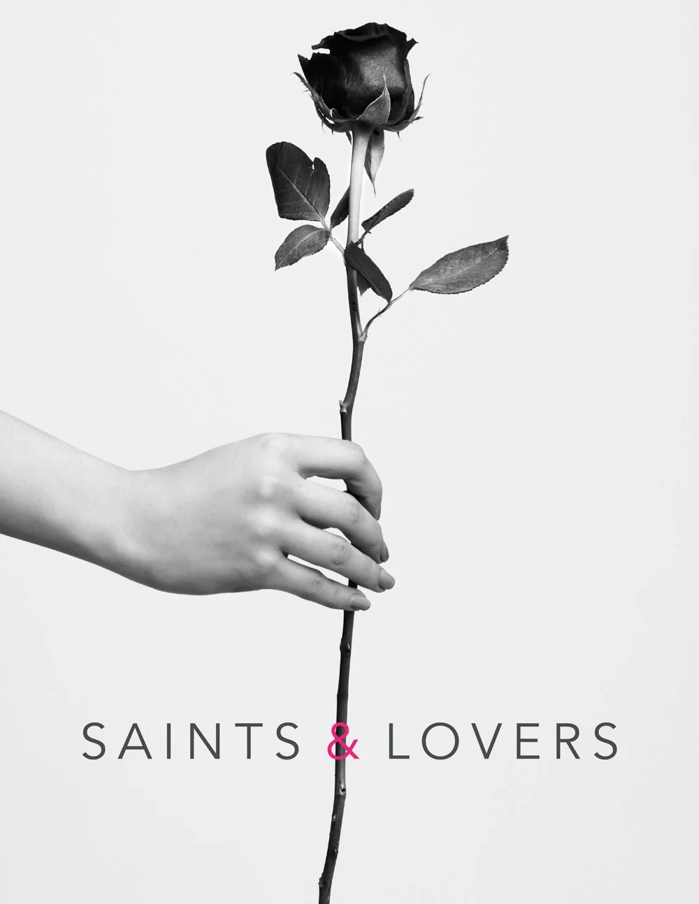
Brand Identity
We wanted the Saints & Lovers logo to sit comfortably alongside the MESOP brand, while holding its own distinct identity. A clean sans serif typeface gave us timeless versatility — a classic base we could build on.
The colour story did the rest. Charcoal became our grounding neutral, allowing swing tags to complement any seasonal palette. Then came a highlight; a neon pink tag thread, echoed in the pink ampersand of the logo. This subtle clash — charcoal for saints, neon pink for lovers — was a quiet nod to the brand’s playful duality.

Campaign & Art Direction
Our launch campaign needed to clearly set the tone: Saints & Lovers is a brand that playfully explores the chemistry between colour, print, and effortless style. This ethos ran through every creative touchpoint — from art direction to textiles, graphics to brand voice. Drawing from 60s inspiration and bold colour play, we created campaigns with confident visuals and nostalgic warmth. Typography and print directions were intentionally graphic and punchy, showing up across everything from lookbooks to EDMs. The result was a visual language that felt fun, recognisable, and full of personality — just like the clothes.

A Holy Trinity . . .
Saints & Lovers happened in that rare sweet spot — where product, brand, and customer all align. It started with a fabric, a feeling, and a cheeky name, and unfolded into a brand that was both considered and full of character. Building it from the inside out meant everything clicked — from swing tags to showrooms, campaign sets to colour palettes. It was smart, playful, and most importantly, loved. A brand that wore its heart on its sleeve. Amen!