Taking the field to digital audiences . . .
The Brief - Website as ecosystem . . .
This project involved a comprehensive website redesign to align with the client's rebranding efforts. The primary goals were to create a streamlined user experience for those wishing to donate or volunteer, design an intuitive information architecture to foster education and learning, and reinforce the brand’s ethos through a brand identity overhaul.
The early stages of the project included thorough competitor benchmarking and heuristic analysis to elevate the brand’s digital presence.
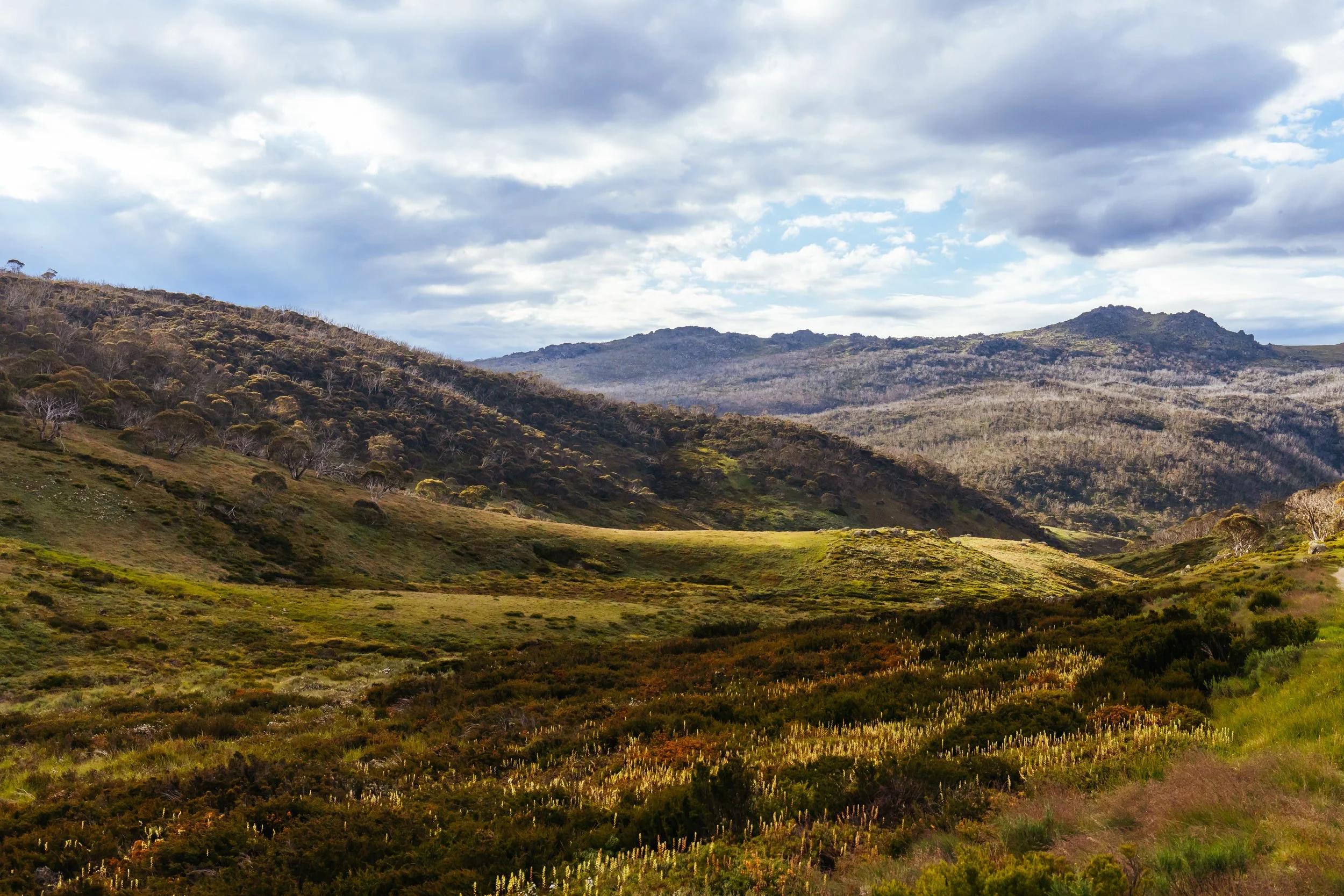
Stakeholder interviews revealed that the website needed to serve more than just a linear journey for users; it was envisioned as part of a broader movement encompassing Indigenous communities and environmental values. This insight led us to rethink the site as an ecosystem—one that accommodates diverse user journeys, amplifies the brand’s essence, and extend its outreach to the wider movement.
UX / UI, Web Design, UX Writing, UX Research
Industry Not-for-Profit
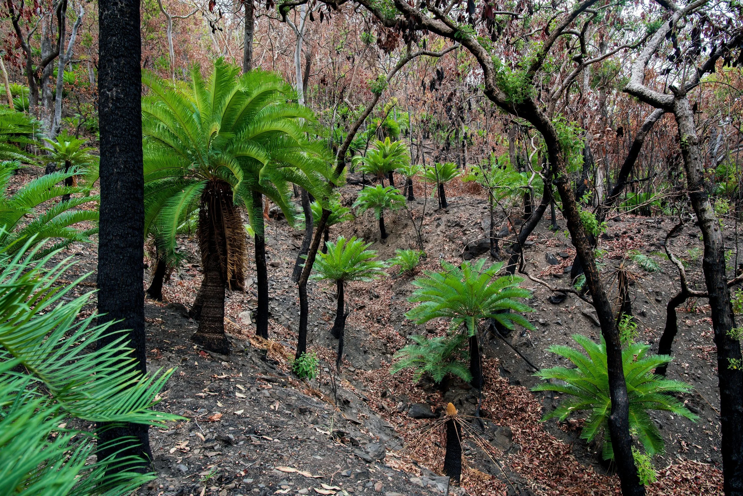
The Client Back to the Bush Indigenous Corporation is a non-profit focused on environmental conservation and Indigenous land management, supporting Aboriginal and Torres Strait Islander communities through sustainable practices and community engagement.
Tools Figma, Slack, Miro, Photoshop
Year 2025
Scope User Research interviews, Competitor Benchmarking, Heuristic Analysis, Wireframes, Information Architecture, Style guide, Design System, Branding, Logo, UX Writing, Responsive Design, Hi-fi prototyping, Developer Handover.

UX website design. Example of Figma animation prototype for a UX enhancement. Circles radiate out to represent community.

A space for getting straight from A-to-B
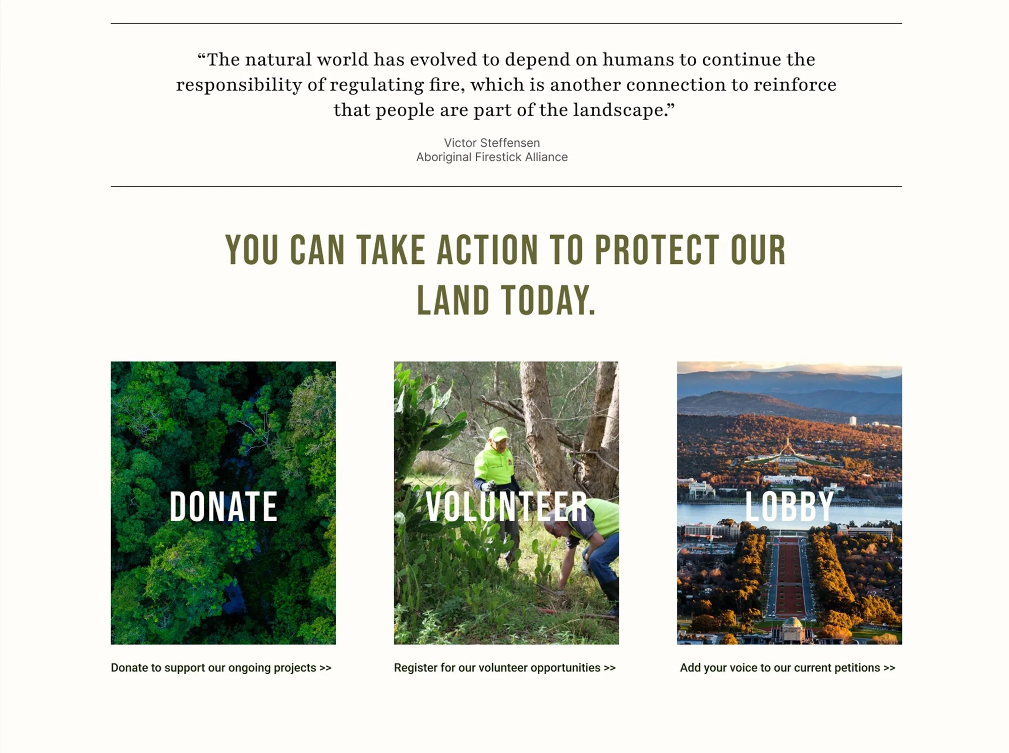
For users seeking to take immediate action (referred to as "hawks"), we designed optimised user journeys with streamlined two-step processes for quick completion. Key features included:
And for those who wanted to go off the beaten track. . .
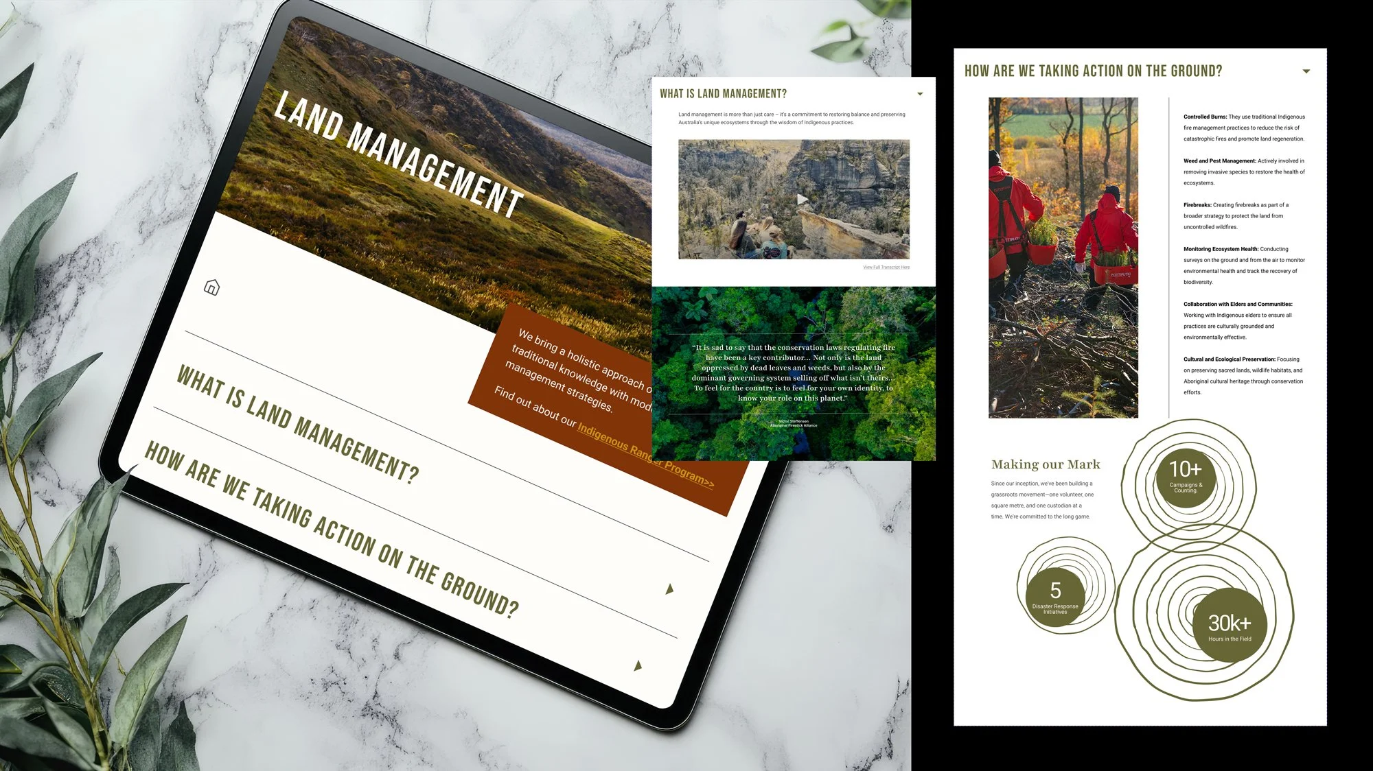
For users engaging in more exploratory journeys, we designed experiences that balanced rich content with an intuitive, non-overwhelming interface. This was achieved through:
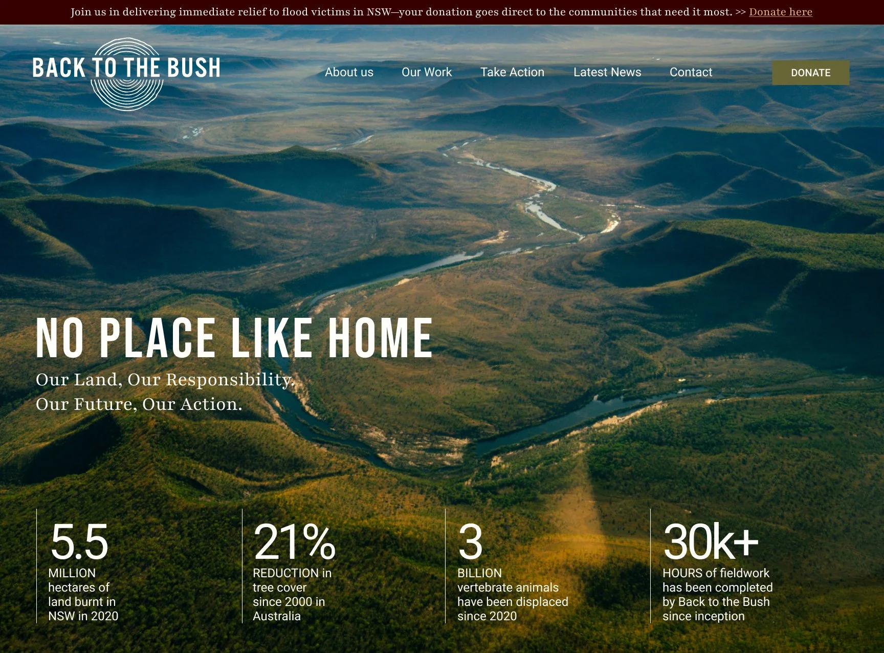
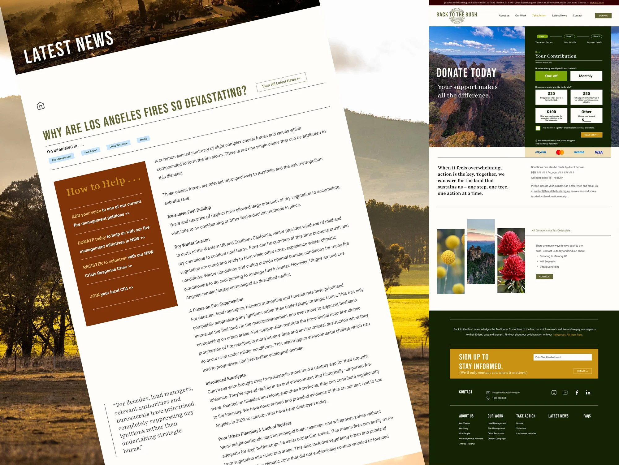
A prominent hello bar with direct links to campaigns enabling easy CMS updates, seamless donations and quick access to the Back to the Bush Instagram network.
Clear calls to action (CTAs), strategically placed buttons, and a navigation structure that adhered to established Industry heuristics, ensuring an intuitive user flow.
An efficient donation plugin that could facilitate a smooth, same-page completion cycle, provide valuable metric analysis, and low cost implementation.
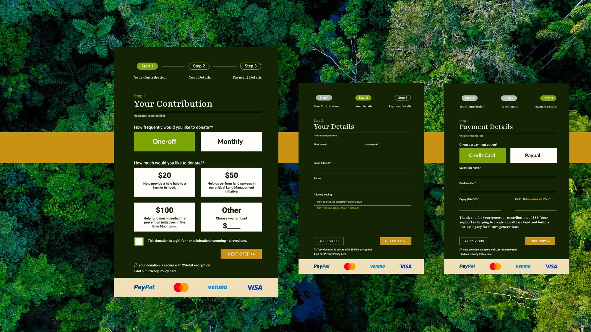
The use of drill-down questions and accordion layouts, allowing users to navigate information at their own pace while maintaining control over their experience.
Strategic placement of "watering holes" at key touchpoints, such as action steps within relevant blog posts, donation widgets at the end of information trails, and Instagram plugins to connect with a broader audience.
A streamlined information architecture, organized into jargon-free interest categories to ensure clarity and ease of navigation.
UX website prototype video run through for a not-for-profit. Shows a scroll through of the UX design.
Growing a digital ecosystem that allows a brand to thrive
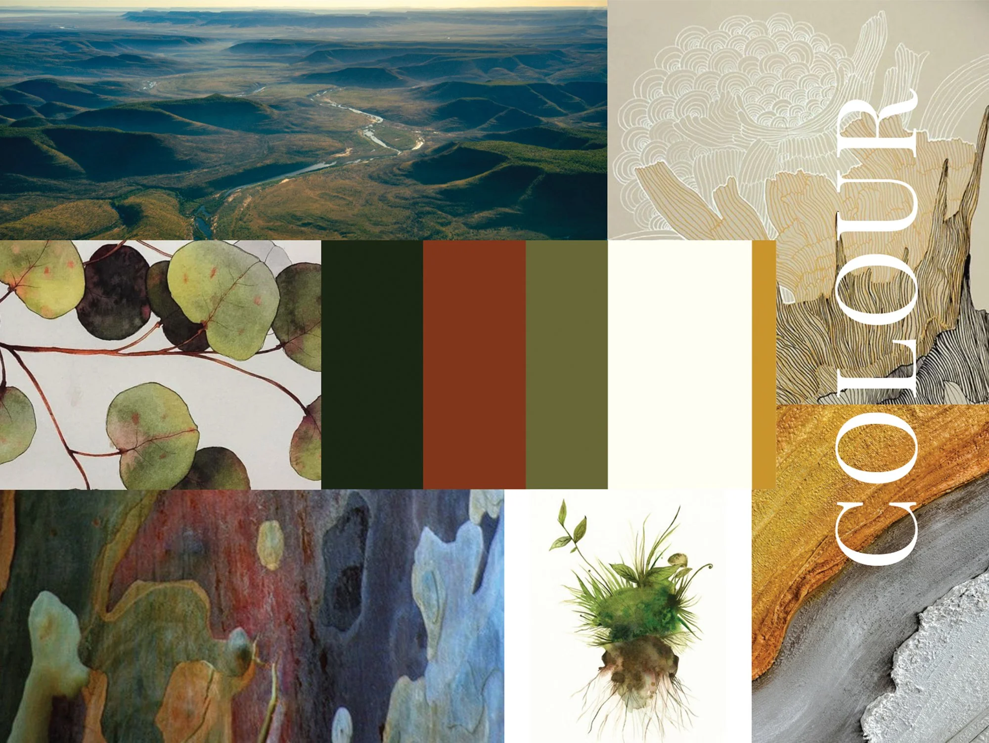
We aimed to reflect the brand’s ethos by drawing on the founder’s story as an Armenian refugee, emphasising themes of home and custodianship, which aligned with the philosophies behind Indigenous land stewardship.
We enhanced the visual design with powerful imagery and interactive branding elements, using subtle animations to reinforce the brand’s values. Multimedia was strategically placed at key touch-points to ensure the brand’s voice remained consistent, while the sleek and immersive aesthetic kept the messaging clear and impactful. We moved from a place of “telling” the brand’s values to place of imbuing them across every aspect of the site.


“Kim is able to elevate the conversation beyond just UX. She considers the broader brand strategy and links her design decisions to tangible business needs.”
Sam Hancock (Project Mentor)
Recommendations; A case of organic growth . . .
Our key recommendations focused on enabling the website to evolve alongside the brand, serving as a dynamic point of interaction between the brand and its users. Next steps included:
Using the site to gauge interest for future initiatives, such as a landowner consultation project and Indigenous ranger programs, by deploying a minimum viable product with simple CMS and form data collection to assess demand before investing in more complex structures.
Building an educational content library through best-practice blog filters and categories, with the goal of metering content across platforms and using metric analysis to tailor future content to user interests.
Strengthening connections with partner organizations, such as the CFA, Sacred Sites Preservation Project, and the Treaty Council Worldwide, to position the brand within a larger, global movement and conversation.
Our take away . . .
Sometimes the A-to-B path isn’t always the preferred route.
A truly responsive site extends beyond the size of a screen, evolving organically over time, in tandem with the brand and its broader environment.